Packaging Design for Kids Lotion
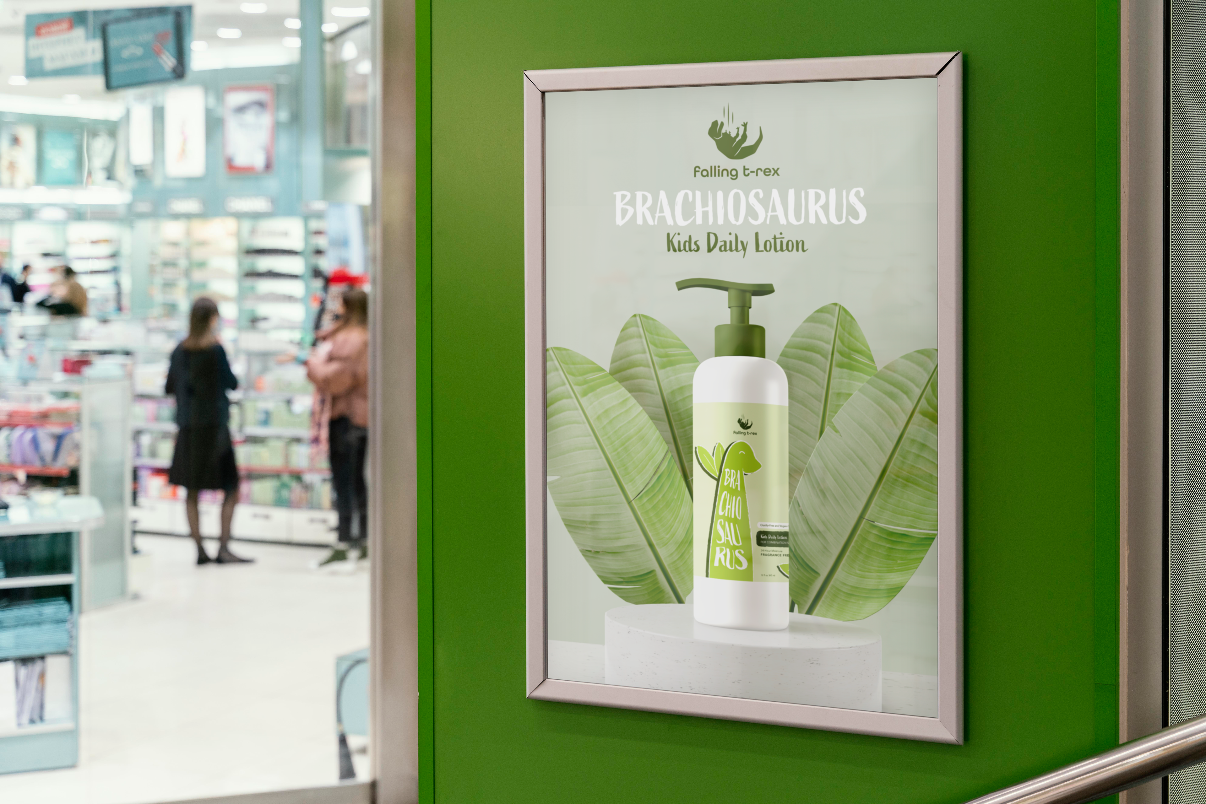
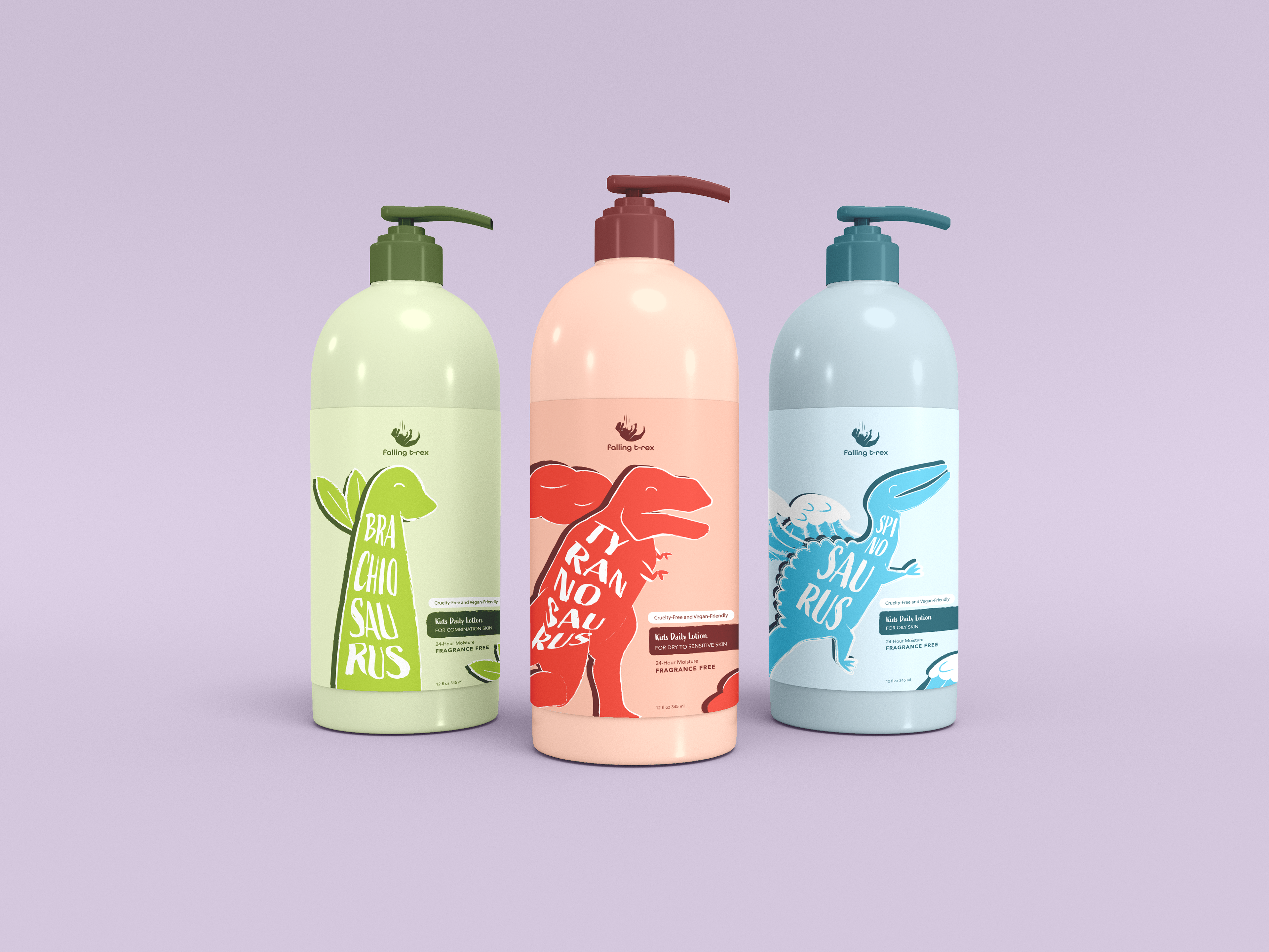
Falling T-Rex is a kid’s daily lotion brand that I developed to educate youth about their skin types as well as the history of the dinosaurs. Creating connections that are understandable from a kid’s point of view was a key goal of these designs. Showing the relationship between one’s skin type and the matching dinosaur that they can relate to. Overall, making skincare a fun and interesting aspect of a child's life from an early age!
Falling T-Rex is a kid’s daily lotion brand that I developed to educate youth about their skin types as well as the history of the dinosaurs. Creating connections that are understandable from a kid’s point of view was a key goal of these designs. Showing the relationship between one’s skin type and the matching dinosaur that they can relate to. Overall, making skincare a fun and interesting aspect of a child's life from an early age!
Work completed for: College class, Graphic Design Studio.
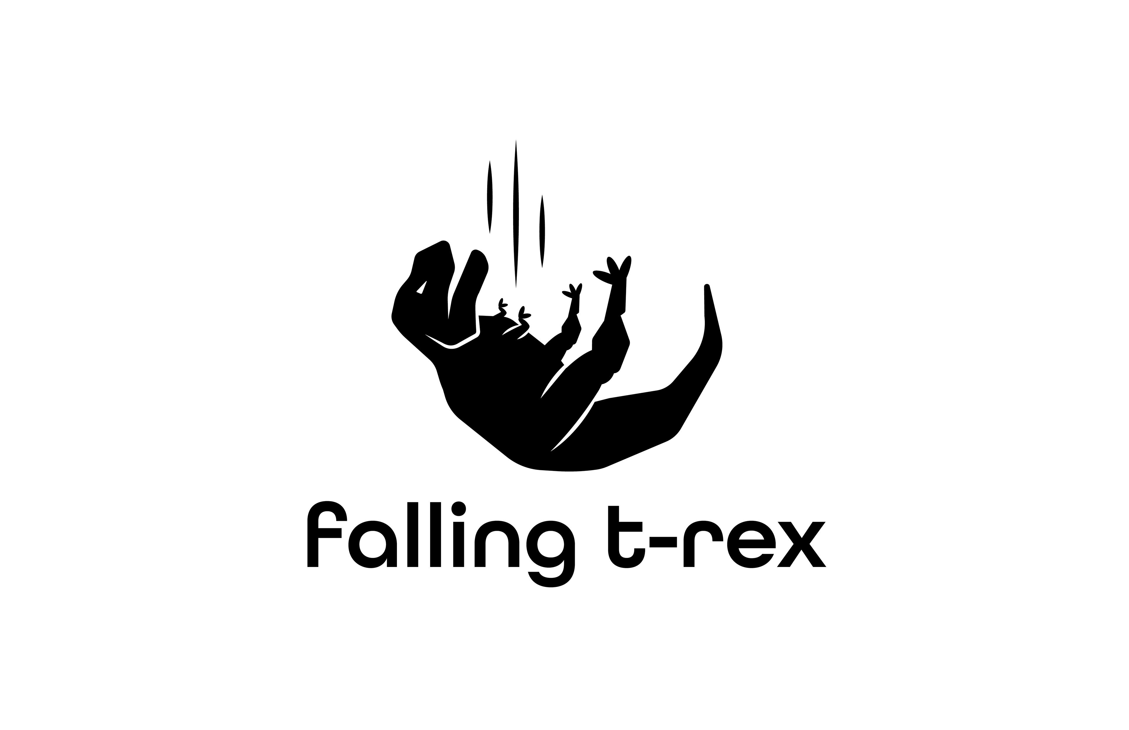
I designed the logo for the brand as well focusing on memorability and communicative elements through illustration and type.
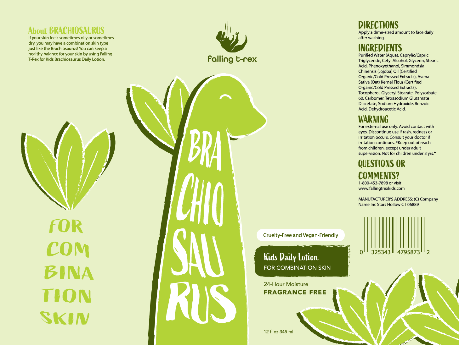
Typography: Some dinosaur names are hard to pronounce so I had the idea of breaking it down into bite-sized syllables that children could visually comprehend upon first glance.
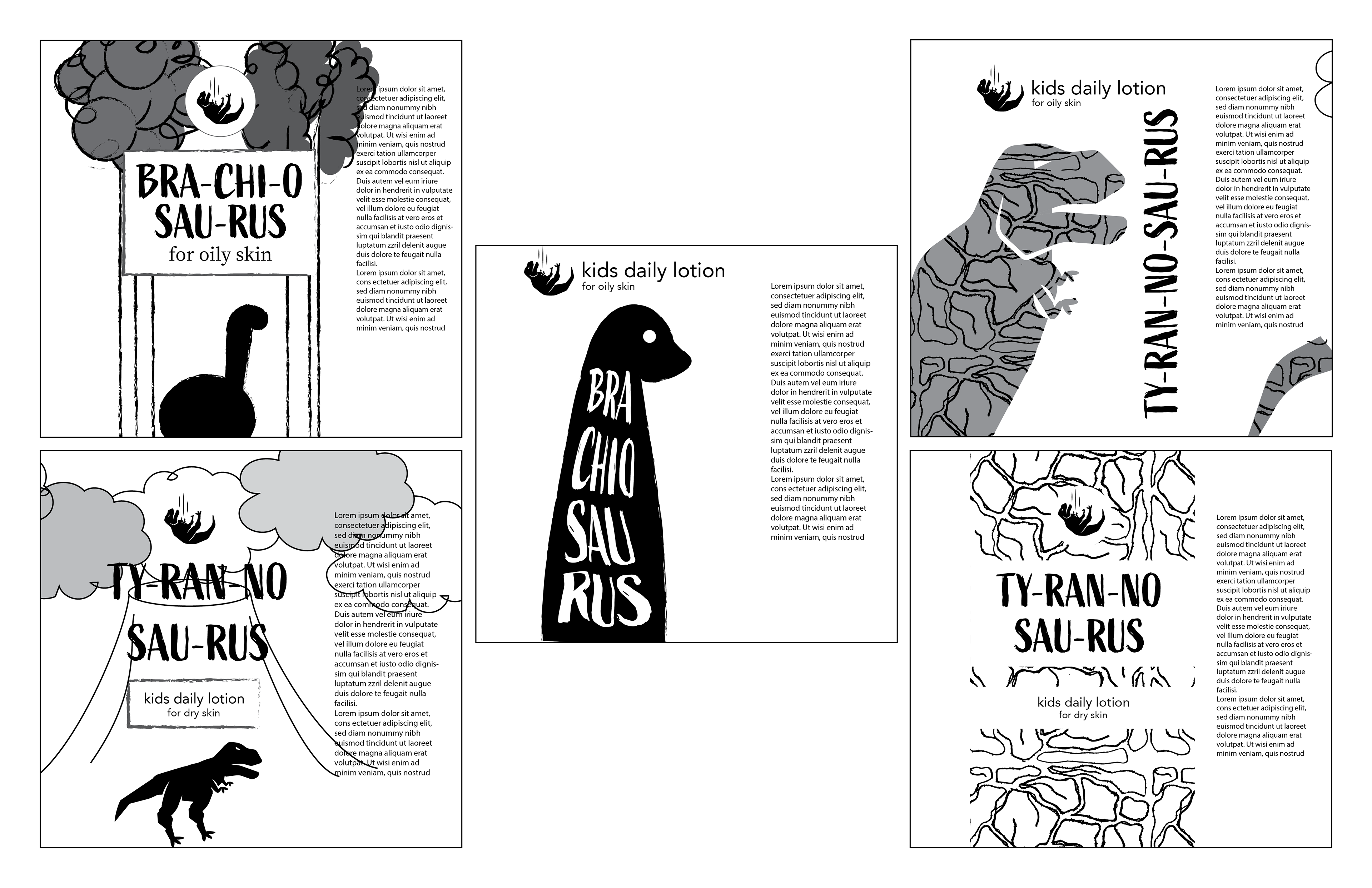
The Process Behind the Package: These are the different ideas I had in mind when conceptualizing what the bottle could look like. I experimented with different environments as well as texture and typography.

Color: When I think of red and inflamed skin, I think of the color red, and I also think of the Tyrannosaurus Rex. I made similar connections with color through the other dinosaur packaging designs.
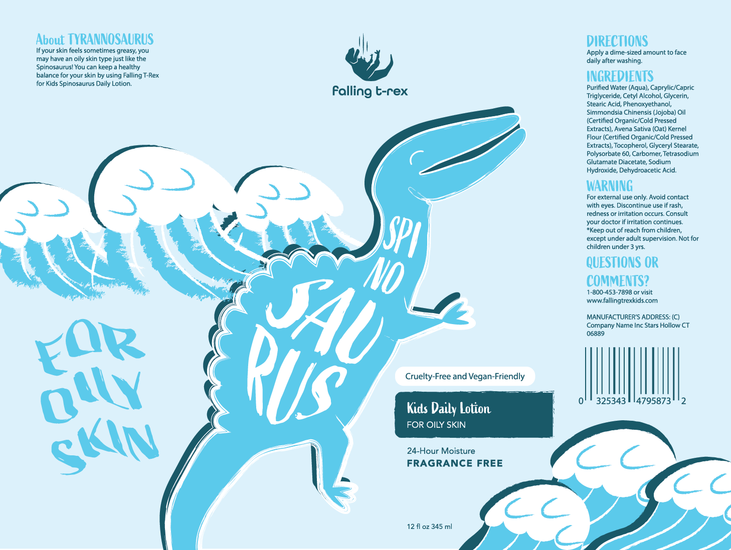
Environment: I wanted to show children different aspects of the dinosaur’s home environment. For instance, using showing waves in the ocean which is where the Spinosaurus lived.